

Eagle Ranch
Add Project Name
Using Item Editor
Brand Strategy
Brand Architecture
Program Naming
Visual Identity System
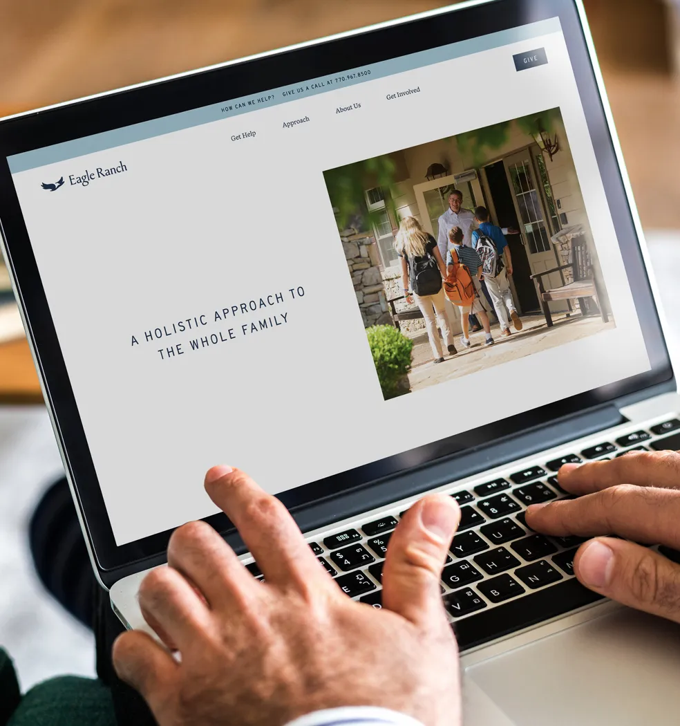
Website Design
Brand Messaging
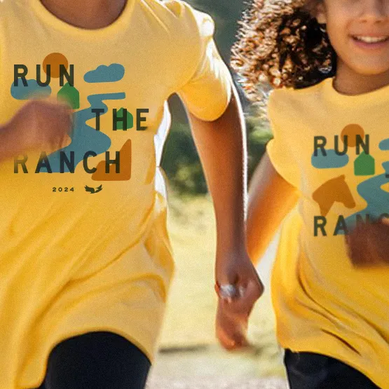
Print Materials
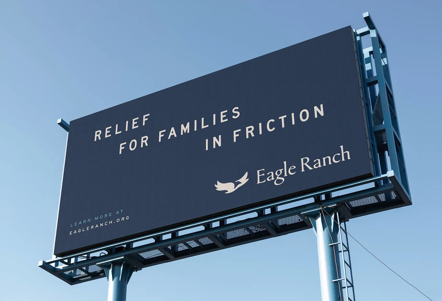
Ad Design / Out of Home
- Once you add text, pics, etc
- You'll be able to edit it here
- On the Item Detail Page
- You will NOT be able to edit
- Placeholders
- Before adding content to the
- CMS item page
“TOGETHER WE FLY”
For us, it’s a metaphor for how we like to work. Part skill, part improvisation. Always paying attention. In the work. It doesn’t just look good, it feels good. We’ve always got a record on in the studio.
Not smooth jazz. Old jazz. Timeless jazz. For us, it’s a metaphor for how we like to work. Part skill, part improvisation. Always paying attention. In the work. It doesn’t just look good, it feels good.
For us, it’s a metaphor for how we like to work. Part skill, part improvisation. Always paying attention. In the work. It doesn’t just look good, it feels good. We’ve always got a record on in the studio. Not smooth jazz. Old jazz. Timeless jazz. For us, it’s a metaphor for how we like to work. Part skill, part improvisation. Always paying attention. In the work. It doesn’t just look good, it feels good.
"Family Renewal"
Eagle Ranch is a nonprofit organization that takes a whole-family approach to restoring and renewing relationships for children and families. With affordable and accessible services, they meet families at their point of need, providing guidance, practical resources and hope for a more flourishing future.
As Eagle Ranch was wanting to build on their decades of impact as a children’s home for vulnerable youth, they started to imagine an expanded set of services that could reach and benefit families beyond their initial scope. They asked us to help them make the brand transition alongside these organizational changes. In partnership, we were able to honor the past and move into a vision of the future.

For us, it’s a metaphor for how we like to work. Part skill, part improvisation. Always paying attention. In the work. It doesn’t just look good, it feels good. We’ve always got a record on in the studio. Not smooth jazz. Old jazz. Timeless jazz.
– Louis Armstrong
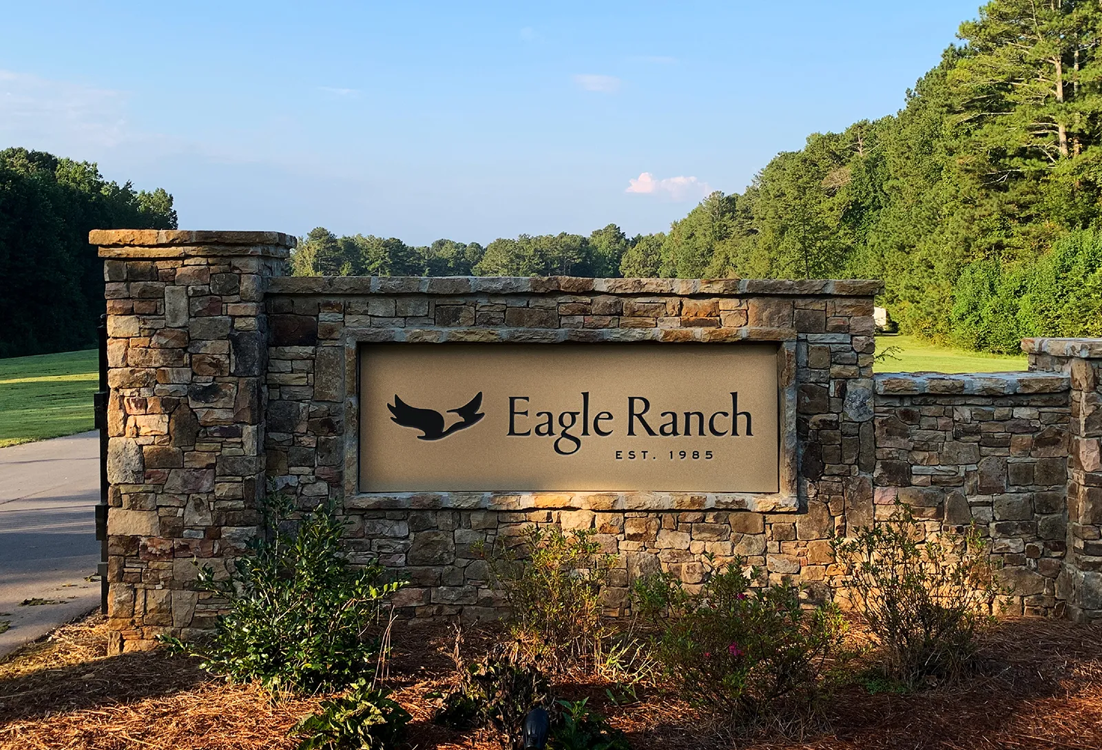
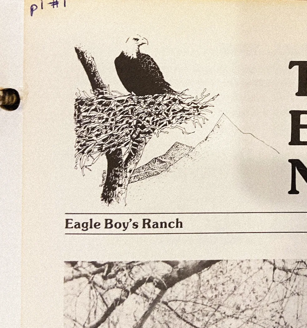
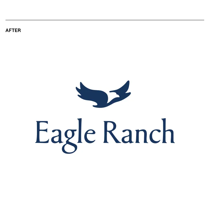
The Eagle Ranch brand identity was in need of an evolution, pulling forward some elements, more so than starting from scratch. We updated the iconic symbol of an eagle in flight to be more bold and more approachable at the same time. We were also inspired by the idea of a nest. A safe and nurturing space. We incorporated this subtle form into the overall shape of the eagle.


For us, it’s a metaphor for how we like to work. Part skill, part improvisation. Always paying attention. In the work. It doesn’t just look good, it feels good. We’ve always got a record on in the studio. Not smooth jazz. Old jazz. Timeless jazz.
– Louis Armstrong
The Eagle Ranch brand identity was in need of an evolution, pulling forward some elements, more so than starting from scratch. We updated the iconic symbol of an eagle in flight to be more bold and more approachable at the same time. We were also inspired by the idea of a nest. A safe and nurturing space. We incorporated this subtle form into the overall shape of the eagle.
For us, it’s a metaphor for how we like to work. Part skill, part improvisation. Always paying attention. In the work. It doesn’t just look good, it feels good. We’ve always got a record on in the studio. Not smooth jazz. Old jazz. Timeless jazz.
– Louis Armstrong
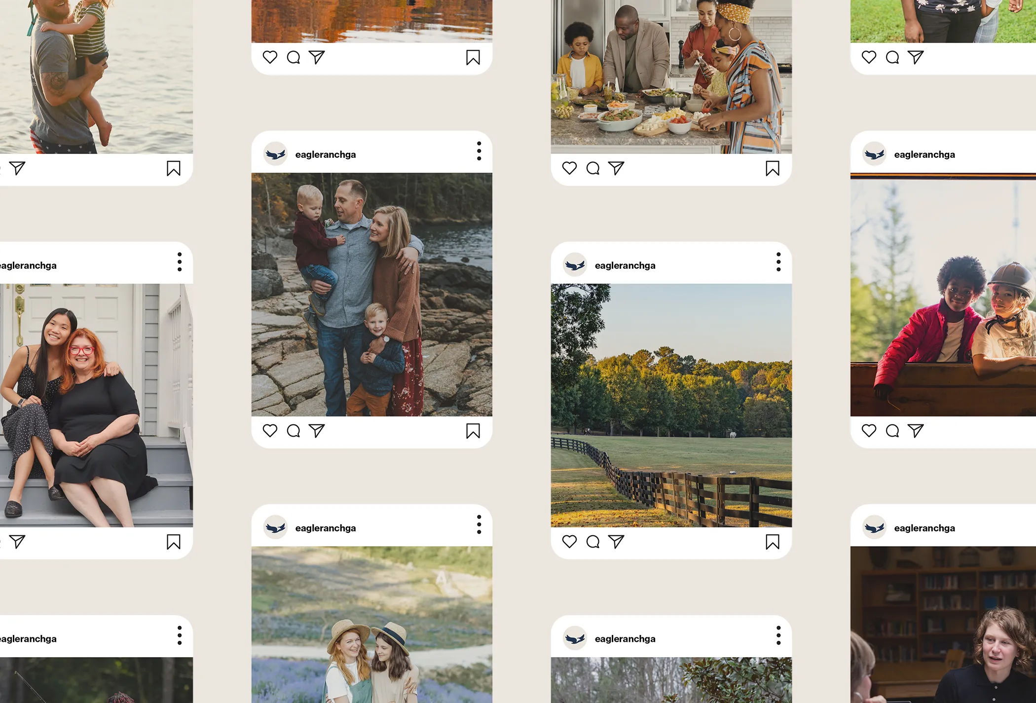
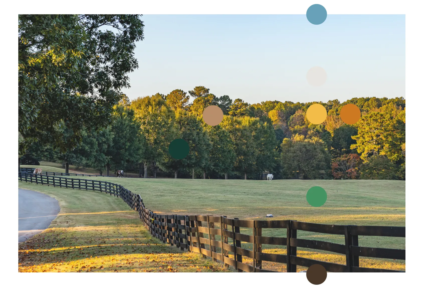
The beautiful landscape of the ranch itself informed our color palette, which we combined with type and compositions that balanced friendly, yet reliable qualities. This helped to convey the hope and relational warmth of the overall brand experience, while also communicating the expertise of their staff and team.
For us, it’s a metaphor for how we like to work. Part skill, part improvisation. Always paying attention. In the work. It doesn’t just look good, it feels good. We’ve always got a record on in the studio. Not smooth jazz. Old jazz. Timeless jazz.
– Louis Armstrong
The Eagle Ranch brand identity was in need of an evolution, pulling forward some elements, more so than starting from scratch. We updated the iconic symbol of an eagle in flight to be more bold and more approachable at the same time. We were also inspired by the idea of a nest. A safe and nurturing space. We incorporated this subtle form into the overall shape of the eagle.
For us, it’s a metaphor for how we like to work. Part skill, part improvisation. Always paying attention. In the work. It doesn’t just look good, it feels good. We’ve always got a record on in the studio. Not smooth jazz. Old jazz. Timeless jazz.
– Louis Armstrong
The beautiful landscape of the ranch itself informed our color palette, which we combined with type and compositions that balanced friendly, yet reliable qualities. This helped to convey the hope and relational warmth of the overall brand experience, while also communicating the expertise of their staff and team.
For us, it’s a metaphor for how we like to work. Part skill, part improvisation. Always paying attention. In the work. It doesn’t just look good, it feels good. We’ve always got a record on in the studio. Not smooth jazz. Old jazz. Timeless jazz.
– Louis Armstrong
The Eagle Ranch brand identity was in need of an evolution, pulling forward some elements, more so than starting from scratch. We updated the iconic symbol of an eagle in flight to be more bold and more approachable at the same time. We were also inspired by the idea of a nest. A safe and nurturing space. We incorporated this subtle form into the overall shape of the eagle.

For us, it’s a metaphor for how we like to work. Part skill, part improvisation. Always paying attention. In the work. It doesn’t just look good, it feels good. We’ve always got a record on in the studio. Not smooth jazz. Old jazz. Timeless jazz.
– Louis Armstrong
The beautiful landscape of the ranch itself informed our color palette, which we combined with type and compositions that balanced friendly, yet reliable qualities. This helped to convey the hope and relational warmth of the overall brand experience, while also communicating the expertise of their staff and team.
For us, it’s a metaphor for how we like to work. Part skill, part improvisation. Always paying attention. In the work. It doesn’t just look good, it feels good. We’ve always got a record on in the studio. Not smooth jazz. Old jazz. Timeless jazz.
– Louis Armstrong
The Eagle Ranch brand identity was in need of an evolution, pulling forward some elements, more so than starting from scratch. We updated the iconic symbol of an eagle in flight to be more bold and more approachable at the same time. We were also inspired by the idea of a nest. A safe and nurturing space. We incorporated this subtle form into the overall shape of the eagle.
For us, it’s a metaphor for how we like to work. Part skill, part improvisation. Always paying attention. In the work. It doesn’t just look good, it feels good. We’ve always got a record on in the studio. Not smooth jazz. Old jazz. Timeless jazz.
– Louis Armstrong
The beautiful landscape of the ranch itself informed our color palette, which we combined with type and compositions that balanced friendly, yet reliable qualities. This helped to convey the hope and relational warmth of the overall brand experience, while also communicating the expertise of their staff and team.
For us, it’s a metaphor for how we like to work. Part skill, part improvisation. Always paying attention. In the work. It doesn’t just look good, it feels good. We’ve always got a record on in the studio. Not smooth jazz. Old jazz. Timeless jazz.
– Louis Armstrong